London Metropolitan University
We’ve worked with London Met for many years and when they wanted a refreshed identity they asked us to take a look.
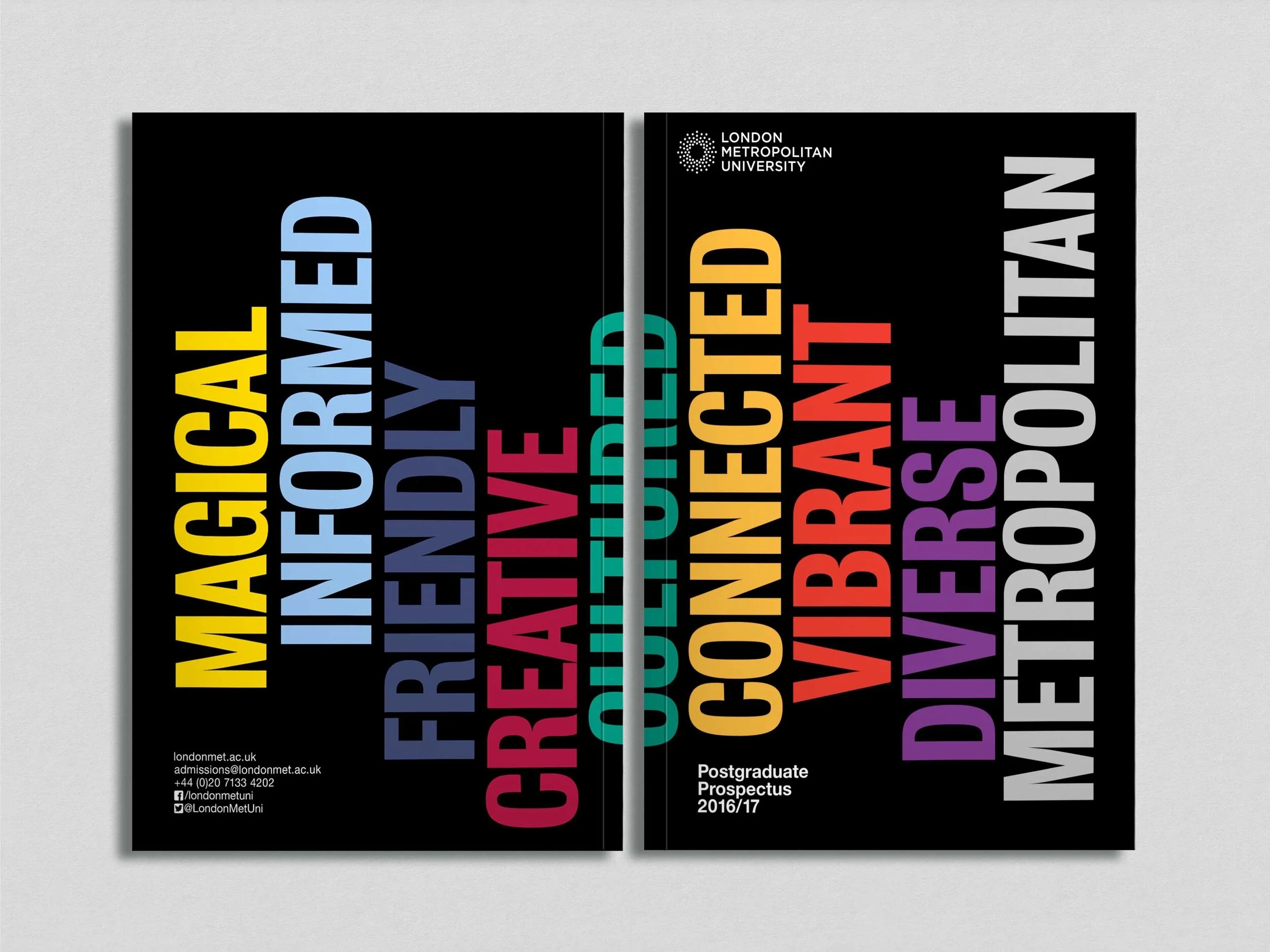
Following a brand audit, it was clear that a lot of departments had gone a bit feral and followed their own design path – a strong unifying brand needed to be applied across the whole University. Working with the marketing department we created the ‘cosmos’ logo to represent the student and staff universe. We developed a colour palette and refreshed typefaces, in-house templates and graphic elements to create a unified identity system. Finally a set of brand guidelines was created to help the internal teams and external consultancies apply the brand consistently.
We applied the new design to prospectuses, merchandise, marketing campaigns for staff and students and created templates for in-house use.
What we did
Audit and consultation
Brand identity
Brand guidelines
Digital assets
Prospectus design
Merchandise
Signage
“Before our re-brand, we didn’t have enforceable brand guidelines and we had multiple sub-brands which weren’t linked back to the main University brand in any way. Turnbull Grey worked with us to address these issues and rationalise our strategy, bringing their creative and diligent approach to the work. The project moved the University towards having a unified voice and consistent look and feel – the latter thanks in part to the many, many templates Chris and Angela helped us produce! Following the redevelopment of our brand, many things fell into line for the University – an improved look and feel contributed to the development of student recruitment campaigns that have bucked trends in the sector, improved internal communications, and helped us to increase interest in studying at the University.”
– Demetria Maratheftis, Head of Marketing